Wednesday, September 06, 2006
Some impressions on Basecamp
By reviewing Teamwork’s competitors, the only one that seems currently relevant is Basecamp (BC), www.basecamphq. com. It seems relevant to me because it starts with a seemingly similar philosophy:
“Projects don't fail from a lack of charts, graphs, or reports, they fail from a lack of communication and collaboration. Basecamp makes it simple to communicate and collaborate on projects”
(from BC’s home page)
We see that we target the same market; we cover a distinct segmentation (BC is for personal – or at most 2,3 people use, Teamwork is for companies), but we will compete anyway. Teamwork covers a much wider set of features; but let’s forget this and compare the two on what they seemingly share.
Testing
After login (“enter” does not move you in the password field, as you would expect), you get in and you see that the interface is inspired by paper layouts. The object model is a simple (simplistic?) view of projects, where there are no subprojects.
The notion of subtask is absent, because it is meant to be dealt with by the "milestone" notion. But milestones are related only linearly, in time; no parallel tasks are possible; how can this model reality?
Don’t even think of doing a filter on search; actually, we couldn’t find almost anything by searching.
Your to-do list can be multiple; it’s funny, because the environment is de-structured, so the simplest features are over-structured.
A typical layout is this:
How could this layout scale? There don't seem to be a search for persons. Companies cannot be organized; there are no departments. Its like moving across a book, where all information is always all printed. But it becomes quickly an A2-sized book, and hence cumbersome to use.
Everything is built having in mind a limited set of data. Well, even a microscopic company like Open Lab has in few years created over a thousand tasks and subtasks, 3000 issues and so on. It is unthinkable to manage this kind of data in the BC interface. Generally I feel like there is a dimension missing. Like Lewis Carroll's flatland, moving around in BC is a problem; in Teamwork there are always the tools to get everywhere else fast.
The subscriptions tab is right in the middle of your management links; but it refers to BC subscriptions! Actually, advertising is everywhere, and is a bother.
In BC, ease of use is got by having software that does little, not by trying to make a powerful program easy to learn. Let’s put something clear: there is nothing wrong in having to learn how to use an application. Do you recall the first time you tried to use Excel? Well, it took some time. Things should be simplified, but not beyond the nature of the problem at hand. By over simplifying the matter at hand, you get an over simplified interface, but that’s not exactly a bright solution. This reminds me the evolution of TV media, where its target gets lower and lower, actively reducing the intelligence of users (I got rid of my TV long ago).
Actually, the fact that it runs in ASP is presented as a feature, but it is a necessity, given the current poor integration capacities of Ruby. We, on Java and Hibernate, have maximized our IT integration capacity.
Minor things
- graphs are not clickable
- accented characters are not sent properly by mail (lack Unicode or UTF-8 support).
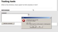
- like Teamwork, but even if it is a much simplified environment, and runs on the supplier server, is not exempt from exceptions:

- It is natural for several users to post different posts on a board at the same time; here it is impossible
(and take care as usual to not get into an advertisement page).
Conclusion
They have buzz on their side, which pushes them on even without quality; we have only quality to help us. We’ll see who wins.
Pietro
<< Home


